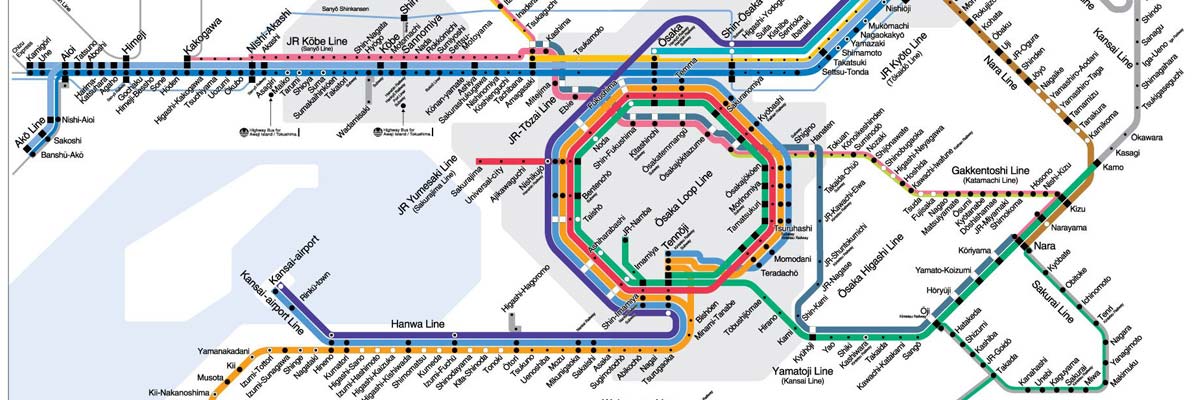
The Mayor of Osaka wished to make the city a more globally recognised centre of commerce. This was to be achieved in part by rebranding the Osaka City High Speed Electric Orbital Co. Ltd. The new logo needed to be easily recognised by the thousands of internationally diverse visitors.
We tested this logo in all major languages and many non-Latin scripts to ensure there were no unwanted similarities with existing characters.
When testing brand names companies often focus on the words and overlook their logo. With so many other logos, symbols and signs in use within any country, avoiding an ‘image clash’ is just as important as using the perfect words.
